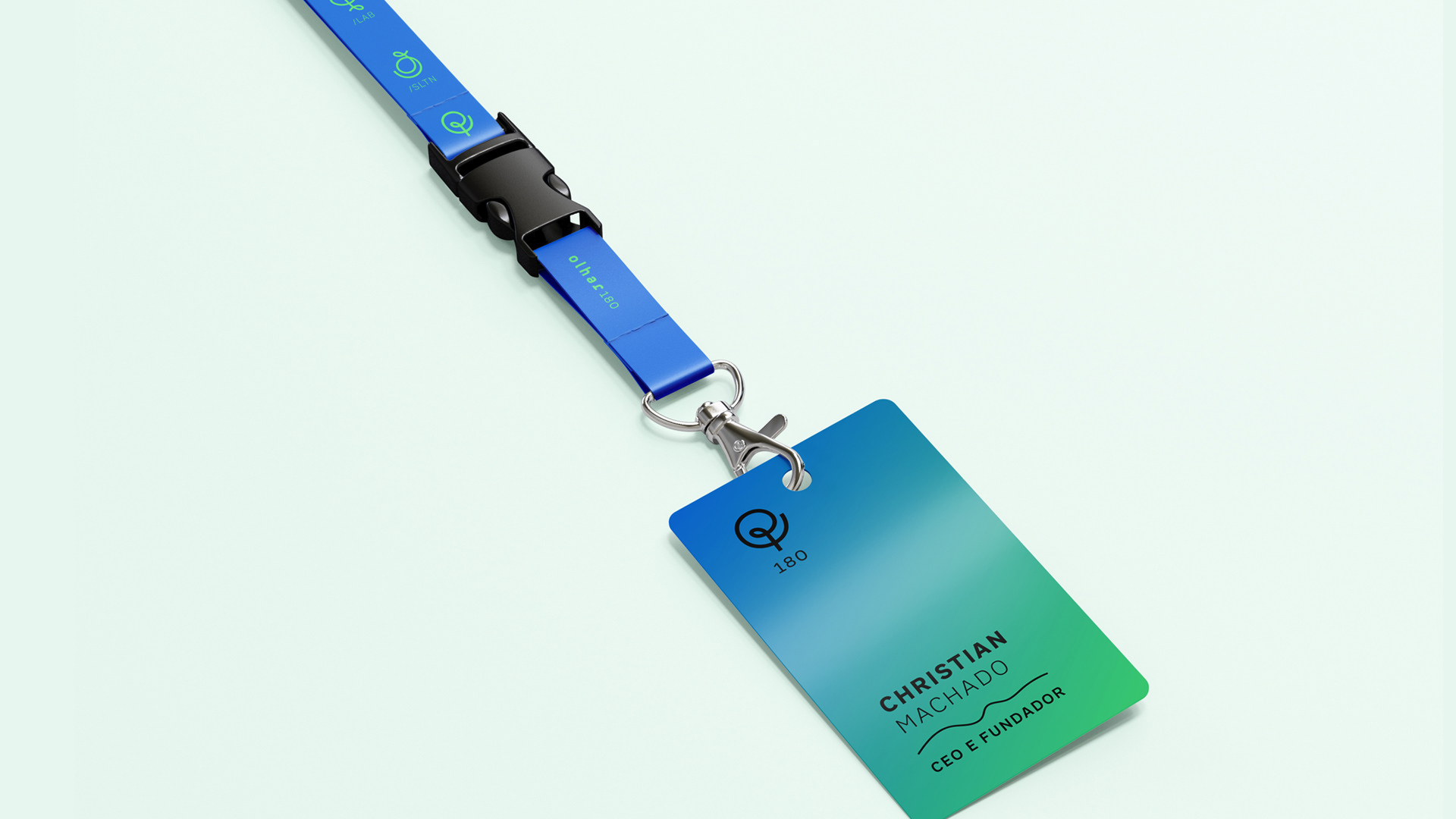
Olhar180 its a research and technology company that develops B2B products and services. In 2020 I was invited to work on a full rebranding as they were expanding businesses and creating two other branches: Olhar Lab, which is responsible for creating products from scratch and Olhar Solutions which takes these projects previously created for the Lab clients and adapts and implements them for other companies.

O conceito por trás dos símbolos criados para as três marcas foi o ciclo de crescimento de uma árvore. O ícone utilizado para Lab representa a criação de um projeto de zero (plantar a semente e ver ela brotando e virando uma pequena muda). Já o de Solutions é um fruto gerado por essa semente que cresceu e virou uma árvore frutífera.
The concept for the icons is the growth of a tree. Lab's icon means creating from scratch (planting the seed and watching it grow). The Solution's one represents the fruit generated by this seed.